I'll start with full disclosure. I wasn't really paying attention in any of my elementary or middle school Art classes.
So I consulted with a certified art teacher (Mrs. L) for this post.
Mrs. L immediately changed the color wheel that I originally chose to show here.
"A real color wheel has yellow on top, the sun always goes on top"!
We have three Primary colors of Red, Blue, and Yellow. Primary means that all other colors are made from these three.
Current Phillies alternate cap is the best example I could think of that uses Primary colors.
Now I can respond to the usual, "You have to have balls to wear that shit!" with "Maybe, but my choice in Primary color combinations is impeccable."
We also have Secondary colors, which are made from combining two primary colors. These are Orange, Violet, and Green
The best example I could find was the Greensboro Grasshoppers.
If you have one and someone asks you, "What team is that?" You can reply," its a representation of secondary colors."
To see the highest contrast of colors, you would put two Complimentary colors next to each other.
The Complimentary colors are:
Red with Green
Blue with Orange
Yellow with Violet
I had to dip into the minor leagues to find this color combination, the Fort Wayne Tin Caps who play in the Midwest League.
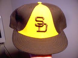
Single-A affiliate of the San Diego Padres
New York Mets
Mets suck!
"Yes, but doesn't the orange contrast beautifully with the blue?"
As for Yellow and Violet?
I couldn't find any MiLB or MLB teams.
Neutral Colors
Brown, Black, Grey and White are neutral colors and they have little connotation.
When asked your opinion , you choose not to answer, simply pull the visor of the White Sox cap over your eyes and say "Enough said."
Colors have emotional connotations as well:
Spas are usually painted greens, blues, and purples because they are cooler colors.
The Rays cap always makes me think of cool colors and brings instant relaxation.
Dark blue is a masculine color that has been used by drug companies for male enhancement pills.
If I put this cap on for....oh, never mind.
Warmer colors have more energetic connotations. Restaurants and stores like to use warmer colors to get you to eat and spend more.

A prison would never paint their walls red.
Let's finish this post with a little humor.
I showed Mrs. L the Art teacher a few caps to ask for her opinion.
Mrs. L admits she does not watch and knows nothing about baseball.
Mrs L: "Very nice, very patriotic, really American with the red, white, and blue theme."
Mrs. L: "Great color combo, lots of energy."


No comments:
Post a Comment