Sunday, March 26, 2017

Bad luck Birds

There's something about a mascot on a MLB on-field cap that gets my attention. 

They are rare, and can look somewhat like a minor league logo, but I find myself wearing a lot of Orioles and Blue Jays caps.

For this post, I will put sole emphasis on the Orioles.


The "Lead-off "Bird was worn from 1954-62.

In 1954 the Orioles went 54-100.

Significant improvement occurred the next year (1955)...they finished 57 and 97.

The wildly popular "Cartoon bird" debuted in 1966 and great success ensued.

The Orioles would win the World Series in 1966 and 1970 with this cap.

In 1975, the white front cartoon panel cap debuts:

And a World Series victory comes in 1983.

On a very recent tour of Camden Yards, the guide explained that the Cartoon Bird was designed by a California Advertising company who also designed the logos for Hamm's beer and the characters Snap, Crackle, and Pop for Kellogs.

The beloved Cartoon Bird was worn until 1988.

Why 1988?  Well, after an 0-21 start, the Orioles finished with a  record of 54-107.

On this same tour, I learned that former Oriole Fred Lynn was very critical of the Cartoon Bird and.stated something like, "look at us in those foolish uniforms, who could take us seriously?

So....


Debuting in 1989, the Orioles return to the 1954 original....sort of.

     "Looking at the change positively, the Orioles have a chance to go somewhere for the first time looking ornithologically proper. They've gone about the switch thoughtfully, dispatching their chief bird man to the Baltimore Zoo to consult with bird experts.

     Their new bird is a little chubbier than the sleek original, and has a bit more orange in it than the first model. Black on black, after all, won't fly.

     But the new-old bird is actually more authentic than the original '54 bird, according to the Orioles' Bob Aylward, who did the zoo research, because "you can get a more accurate representation with present-day technology." (Gildea,, Washington, Post 1988.)

     The oriole on the 1989 cap did not really look like any Oriole I had seen before.  So, I did a quick google search.  Here is the common picture that appears:


I also learned that there are many types of  Orioles such as:  Bullock's Orioles, Orchard Orioles, Northern Orioles, and Baltimore Orioles.

     As for the record in the first year of the new cap?  Well, the Baltimore Orioles would make a dramatic improvement and finish in second place with a record of 87 and 75.


     I reached out to a certified ornithologist in my area and sent him a picture of this cap:
I  did not ask for permission to use his name so I will not disclose.  I asked him what type of Oriole this is and if it can be determined if it is a male or female Oriole?

"That is a male Baltimore Oriole which has also been called Northern Oriole.  Male orioles are more colorful than the females because the brighter colors are a feature of sexual selection common among birds.  Females tend to be duller colored so that their visits to their nests are less obvious, preventing nest predation."


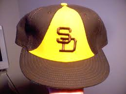
This cap debuted in 1995 as the road cap but the players refused to wear it after three games.

The Orioles would go 71 and 73 in 1995.

In 1997, they would go 98 and 64 and win the division.

In 1998, the logo undergoes another change:

1998's record would be a disappointing 79-83 4th place finish.

In 1999, the bird gets yet another makeover:


It didn't make a difference in the standings....78-84.

And team record were just downright terrible from 1999-2011.


Finally, in 2012, the beloved and reworked cartoon bird is brought back.

Is it just me or does he appear to have found some weight?

And in his first year back on the cap?  93 and 69 for a second place finish and Wildcard victory.

Success has followed ever since.

Caps and the Color Wheel

I'll start with full disclosure.  I wasn't really paying attention in any of my elementary or middle school Art classes.

So I consulted with a certified art teacher (Mrs. L) for this post.


Mrs. L immediately changed the color wheel that I originally chose to show here.

"A real color wheel has yellow on top, the sun always goes on top"!


 I wanted to learn about color theory and psychology and how it may relate to baseball caps.  Here's what I came up with:

We have three Primary colors of Red, Blue, and Yellow. Primary means that all other colors are made from these three.
Current Phillies alternate cap is the best example I could think of that uses Primary colors.

Now I can respond to the usual, "You have to have balls to wear that shit!" with "Maybe, but my choice in Primary color combinations is impeccable." 


We also have Secondary colors, which are made from combining two primary colors.  These are Orange, Violet, and Green

The best example I could find was the Greensboro Grasshoppers.
If you have one and someone asks you, "What team is that?"  You can reply," its a representation of secondary colors."


To see the highest contrast of colors, you would put two Complimentary colors next to each other.

The Complimentary colors are: 

Red with Green

Blue with Orange

Yellow with Violet


I had to dip into the minor leagues to find this color combination, the Fort Wayne Tin Caps who play in the Midwest League.
Single-A affiliate of the San Diego Padres


New York Mets
Mets suck!
"Yes, but doesn't the orange contrast beautifully with the blue?"


As for Yellow and Violet?
I couldn't find any MiLB or MLB teams.


Neutral Colors

Brown, Black, Grey and White are neutral colors and they have little connotation.


 When asked your opinion , you choose not to answer, simply pull the visor of the White Sox cap  over your eyes and say "Enough said."


Colors have emotional connotations as well:

Spas are usually painted greens, blues, and purples because they are cooler colors.


The Rays cap always makes me think of cool colors and brings instant relaxation.

Dark blue is a masculine color that has been used by drug companies for male enhancement pills.


If I put this cap on for....oh, never mind.

Warmer colors have more energetic connotations.   Restaurants and stores like to use warmer colors to get you to eat and spend more. 


A prison would never paint their walls red.

Let's finish this post with a little humor.

I showed Mrs. L the Art teacher a few caps to ask for her opinion.

Mrs. L admits she does not watch and knows nothing about baseball.


Mrs L:  "Very nice, very patriotic, really American with the red, white, and blue theme."

Mrs. L:  "Great color combo, lots of energy."

Baseball Milquetoast

Baseball Milquetoast

I'm not exactly sure what this means...but I am sure that the Baseball Milquetoast Blog is a definite read for  cap collectors.

I have been reading this blog for a long time and decided to reach out to the author to see if he would be interested in a little interview.

Here is what I learned:

What do you consider to be your most prized caps? 
For me, this has to be broken down into two categories: the first category is "what cap is so old and/or rare that finding it is a near impossibility." The other part to that is, "why is that cap something that you want in the first place?"

The second category is "what cap maybe isn't so rare but it has a major significance to you?"

As for the first category, I'd have to say the most significant cap that I own is the Charleston Rainbows cap. I am pro-equality in all aspects and I love that the Charleston RiverDogs players wear the throwback Rainbows uniforms on Pride night.

The second category is a bit easier for me to explain. The cap for that is the New York Yankees 2007 All-Star Game cap. I was living in the San Francisco Bay Area in 2007 when the Giants hosted the All-Star Game and it was the first time I ever lived in a city that was hosting the Mid-Summer Classic.

At any rate, I really wanted to go to the game but I wasn't about to shell out that kind of money for tickets so I skipped it. My cap addiction wasn't as out of control in 2007 as it was in other years but even still, I never picked up the All-Star Game cap as I didn't think patch caps were that cool until I moved to New York City in 2010.

It was then that I began to appreciate the significance of the cap patch because the Yankees had a few gems 2009 when they won the World Series and the year before when they hosted the 2008 All Star Game.


Do you have a main rotation that you wear on a regular basis?

When you have an uncontrollable amount of caps, it's important to spread them out so that none feel neglected. For that reason, I try to keep the selections seasonal in that during October and November, I'll either wear a Giants World Series Cap or my Scottsdale Scorpions cap.

In late June and through the All-Star break, I wear the All-Star Game hats when I can, especially to Yankees games.

The most special of all seasonal caps is my New York Yankees 2008 "Virginia Tech Game" cap. Check the link for the backstory on that one; I love wearing it to Yankees games in April because of the significance of that cap carries.


Favorite manufacturer/seller?  (New Era, Wilson, Sports Specialties, or other?)

New Era was my first love but I do miss that the caps are no longer Made in U.S.A. Hopefully they can go back to that because that was a strong selling point for me.

I've got lots of caps from Ebbets Field Flannels and they're all Made in U.S.A. which I appreciate plus their craftsmanship is top-notch.


What is your opinion of New Era putting the flag on the side of the cap in 2017?

I think the consensus there is that it's a bunk move but I look at this is a clear defining moment in cap collecting. When New Era decided to go with black underbrims and 100% polyester caps in 2007, the cap collecting community was ablaze with hot takes.

People either angry at the change or they welcomed the fact that they could wear these new caps without worrying their underbrims and sweatbands would stink and that the crown would shrink.

I have to admit it was a lot of fun going in to hat shops and buying up all of the grey underbrim inventory because I was worried that these new polyester caps were going to be trash. A benefit of the 2007 change for vintage cap collectors is that now we know we're looking at a cap that is "vintage" if the sweatband tags and underbrim match the proper specifications.

I have all the MLB caps that I need but I am a sucker for the Turn Back the Clock caps so I really hope the New Era flag doesn't make it onto those releases. If they do, then we've always got Ebbets!


Did you notice that the trend in MILB caps is to get away from parent club affiliation and very cartoonish to the point of silly?

I'm from a minor league town so I personally have no problem with that aspect of MILB caps. I really love the re-branding work that Brandiose has done over the past few years and I hope that they continue to grow creatively and inspire their peers to do the same.

Now if EVERY team has a cartoon duck or cannoli as its logo then we have a problem. Otherwise, game on!


Any caps that you are on the lookout for but not able to find?

I realize I just said I'm cool with some of the more "out-there" MILB logos but I definitely do appreciate how some of the farm clubs used to incorporate their parent team's logo in order to create something that was uniquely their own. One example that comes to mind are some of the Midland Angels hats that I've written about in the past.

While I have been able to secure the Midland Angels cap a few times, there is one cap that has escaped me for the longest time: the Jacksonville Expos. Here's a photo of Randy Johnson (that's the large version, just like Randy himself, in case you want it) when he was on that team:


I did find a guy who had one but he wasn't willing to part with it. I know I'll come across it one of these days but man I sure was disappointed when we couldn't strike a deal on it. Oh well!


What was your favorite post from my blog?


Well, the one that brought me to your blog I'd say is the one that speaks to me most: the Montreal Expos 1994 "World Series" hat. I love that hat and that it represents "what could have been" so I was really glad that you wrote about it!

What is your profession?
My profession? I'm a professional cap collector; what do you think?!? Actually, that's what my wife jokingly accuses me of but all kidding aside, during the day I'm a SharePoint administrator and developer.

That question actually kinda brings us back to reality nicely. I really did believe for a second there that I was a professional cap collector!

There is  a link on my page for Baseball Milquetoast for a reason.  Very informative and an entertaining read.  Check it out at http://www.baseballmilquetoast.com/