You are looking at a famous painting known as "Spring Rain" created by John Sloan in 1912.
I recently wandered into an Art Class at my place of employment and this painting was the focus of the lesson.
The instructor asked, "What do you notice?"
I look at the picture and see a menacing tree, a shapely woman dressed in black. Is she on her way to work? Is she going to a funeral? The point of view: is it someone watching from on one of the benches in the picture?
I only enrolled in one art course in college with the hopes that there would be good looking girls in the class. When I look at any type of serious art work or painting, I have no idea what I am looking at.
However, when I see certain authentic MLB caps, I am looking for certain details.

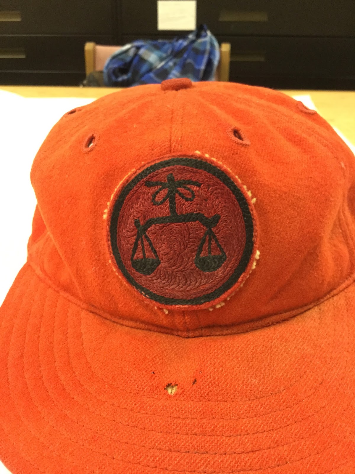
Notice a difference in the logo?

I love the Padres Taco Bell caps. From 1980-82 (on the left) the logo was thicker and in 1983-84 (right) the logo became thinner. The Taco Bell cap was dropped after the 84 season.

This Cincinnati Reds cap is widely known to collectors and was worn from 1993-98. On the left is the retail version (wool) and a Damon Berryhill game worn on the right (nylon). Notice the differences in the "C" and the color of the eyelets?

Whenever I see this Cardinals alternate that debuted in 1992, I always look at the underbrim. 1992 was the only year that the underbrim was green. These caps are pretty rare and make a nice collectible.

In 1998 the Padres introduced this alternate cap .Notice the white button on top? In 2000, the button changed to Navy.

In 2004, the Padres introduced this new design.

It may be hard to see, but the cap on the left (2004 model) has a raised logo while the cap on the right is flat (2007 model).

The Boston Red Sox cap on the left is from 1981-87. In 1997, the serif's got considerably longer.

Love them or hate them, the Yankees have the most recognizable logo in all of professional sports. They were also the last MLB team to wear a green underbrim in 1994 before they changed to grey in 1995.

Most MLB fans noticed that the underbrims on all the on-field caps changed to black in 2007. The Angels (1997) and Rangers (2003) were the first teams to try the new color out..

These models are very hard to come by and whenever I see one of these for sale I jump on it.

This version of Chief Wahoo first appeared on an Indians cap in 1986 on a black cap. In 2003 you can notice that Wahoo gets smaller and the cap went from black to navy blue. The outline on Wahoo also changed from white to silver.

This Cardinals alternate debuted in 1998 (left) with a red beak, it was the only year that the beak was red and has remained gold ever since.

Orioles alternate debuted in 2005 (left). On the right is a mistake by New Era that is very rare. I have never seen the version on the right being worn by any Orioles player.

The Mets Inaugural season was in 1962 and they began wearing a blue button on the top of the cap. In 1997 they changed to an orange button on top...and that is when I stopped wearing them.

Worn for the first time at the end of the 1990 season, this current White Sox cap is one of my favorites. The cap on the left is from 1991 and on the right is a 1997 model when the logo became slightly thicker.

Can you see the difference here? MLB Collectors tells me before 1994 the button was navy and then it became orange.